
A while back on the blog we did a series that touched on changing between linear and log scales on the fly in Power BI. In this post, we’re going to see how using the Charturo custom visual from the Power BI Appsource simplifies the process of adding this functionality to Power BI Reports and the functional benefits of using Charturo over the standard Line Chart.
Charturo is an interactive line chart Mi4 has developed that allows the end users to switch between log and linear axes directly on the chart surface. It also allows inverting the Y axis, but we will spend most of this post talking about the Linear & Log functionality.
Let’s jump right in and take a look how we would use Charturo to create a line graph for an Oil and Gas Well Production use case visualizing oil, water, and gas production along with tubing and casing pressures.
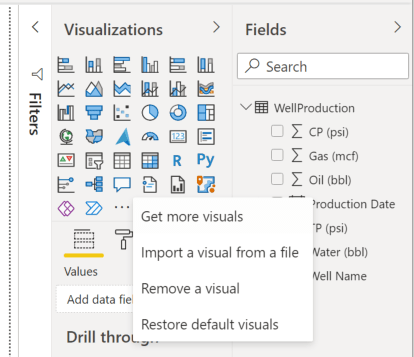
We’ll assume a data model with the following columns: Production Date, Well Name, Oil (bbl), Water (bbl), Gas (mcf), TP (psi), CP (psi). Once the data is imported or connected in the Power BI report, you can add Charturo by clicking the “…” in the Visualizations tab, selecting “Get More Visuals”, and searching for Charturo.

You can add Charturo to the canvas just like you would the standard line chart and drop your data points into the appropriate wells in the Visualization pane. And that’s it. That is all you need to do to have a line chart that can switch between linear and logarithmic scales on the fly.


Now let’s take a trip down memory lane and look how you could achieve a similar report using only the standard Power BI visualizations.
In our 2019 blog series we had to perform the following steps to enable switching between linear and logarithmic scales on the report canvas
- Create a DAX measure FOR EACH SERIES we wanted to visualize
- Create a “ScaleType” table to hold the label values “Linear” and “Log”
- Place a slicer on the canvas and associate with the “ScaleType” data table
- Create a DAX measure to force the line chart to display the appropriate scale based on the selected value
In 2021, all of this still holds true. There have not been any changes in Power BI that would make this process easier with the standard Power BI visualizations.
To get the same functionality using Charturo, you do not need to implement any of the steps above. Charturo is plug and play.
In our 2019 blog series, we were visualizing 5 different line series on a standard Power BI line chart. Fore each series to be displayed in logarithmic scale on the standard line chart we had to write a DAX measure FOR EACH SERIES.
SunAngle = IF(CONTAINS(GraphLines,GraphLines[DataCol],"ls"),IF(sum(marsweather[ls])>0,sum(marsweather[ls]),BLANK()),BLANK())
To gain the functionality to toggle between Linear and Log we had to write a DAX measure to intentionally “break” the requirements to display series on a logarithmic axis and force the default line chart back into a linear scale.
LinearLog = IF(SELECTEDVALUE(Scale[ScaleType]) =

"Linear",

CALCULATE(sum(marsweather[pressure]),LASTDATE(marsweather[terrestrial_date]))*0,BLANK())
We also had to create a separate 1 column, 2 row table and link a slicer to that disconnected table to be able to switch between linear and log from the report canvas itself.
Total that up and it’s 11 measures, a disconnected table, and a slicer. To accomplish the same thing in Charturo you need 0 measures, 0 disconnected tables, and 0 slicers.
Please take Charturo for a spin and let us know what you think.