
Most websites that offer Nutrition Facts and Food data lookup functionality seem to offer a top down, food driven search function. First you select or search for a food and they return the nutrition facts for your selection. I was looking for the opposite and I couldn’t find it. Thanks to Power BI, I was able to build one in minutes, here’s how I did it…
Why I built this quick dashboard:
I was interested in certain nutritional criteria and wanted to list the foods that matched. Specifically, I was trying to find items that are high in dietary fiber, and low in carbs. Luckily, with Power BI and a handy food data spreadsheet, I was able to build exactly what I needed in minutes. Here’s how you can do it too.
Getting Clean Data
First, download the FNDDS Nutrient Values.xlsx spreadsheet from the USDA’s FNDDS (Food and Nutrient Database for Dietary Studies)
There are several other sources for this data, such as the FDA’s Food Data Central Data site which includes more detailed datasets in JSON, CSV and even a soon-to-be-discontinued Access Database (Access mdb no longer cool enough for you, FDA?).
I chose the FNDDS spreadsheet because it is the prettiest one and ready to rumble. Here’s how it looks like out of the box.

Starting with clean and well formatted data is key to save yourself a lot of time and headaches.
I highlighted the first row in the image above because it needs to go. You can just delete it manually in Excel before you import the data, and this will be all the work you’ll have to do.
However, I will leave this row in, and then show you how to skip it inside of Power BI. This is a useful step in case you want to automate the download of future Excel files to replace this data with new data.
Adding the Data to Power BI
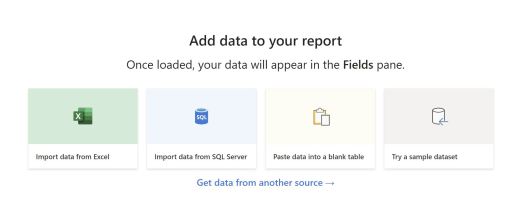
Open the free Power BI Desktop application and select Import Data and Excel as your source.
Next select the first worksheet in the workbook but instead of clicking Load, click Transform Data.

The Query Editor window will open, just click on “Use First Row for Headers” and then click on Apply & Close in the top left corner and you’re done with the data wrangling.

Display the Data in your favorite Power BI visual
I like to use the SandDance visual, which you can find by clicking on the ellipsis in the Visuals pane and then on Get More Visuals


Search for SandDance and then click Add to install it in your report. A new Icon will be visible under the default visuals in the visuals pane.
You can use any visual you prefer, such as a Table and some Slicers.
The beauty of the SandDance chart is how fast you can slice and dice the data along different features out of the box. You just select the columns you want, and they will automatically get added to the chart
Pro Tip: If you maximize the chart, it will obscure the 3D mode button. So leave some space between the top of the chart and the top of the canvas to avoid looking for that missing button and getting frustrated like I did! (see below)

Below is the finished Power BI Report, use the Full Screen view in the bottom right corner and hover over any data point to see its values, you can also add filters and change the axes data.
If you like this tutorial please subscribe so you can get notified of future posts