
A new Small Multiples visualization feature has been released for public preview in Power BI. I was thrilled to see this first announced on the roadmap and am looking forward to putting it through its paces now that it is out in preview.
“Small Multiples” use multiple similar views to show different partitions of a dataset. Small multiples are sometimes called trellis or grid charts and until now, you have had to use custom visuals or some SVG tricks to get the functionality in Power BI.
In order to try out Small Multiples in Power BI Desktop, you will need to enable it in the “Preview features” section of the Options menu. After you have enabled it and restarted Power BI Desktop, if you are expecting to see a new visualization icon for Small Multiples in the main Visualizations pane, you won’t find one.
There is not an icon for it in the Visualizations pane because “Small Multiples” is not a new visual, it is a new visualization feature that has been added to existing Power BI visuals. Currently line, bar, column, and area charts support Small Multiples. For more information about how to enable the feature and use cases, I recommend checking out the announcement post on the Power BI blog.
I took an hour or so last week and put together some Oil and Gas sample reports utilizing the new feature and I wanted to share the results with you.
Maxing out the Grid
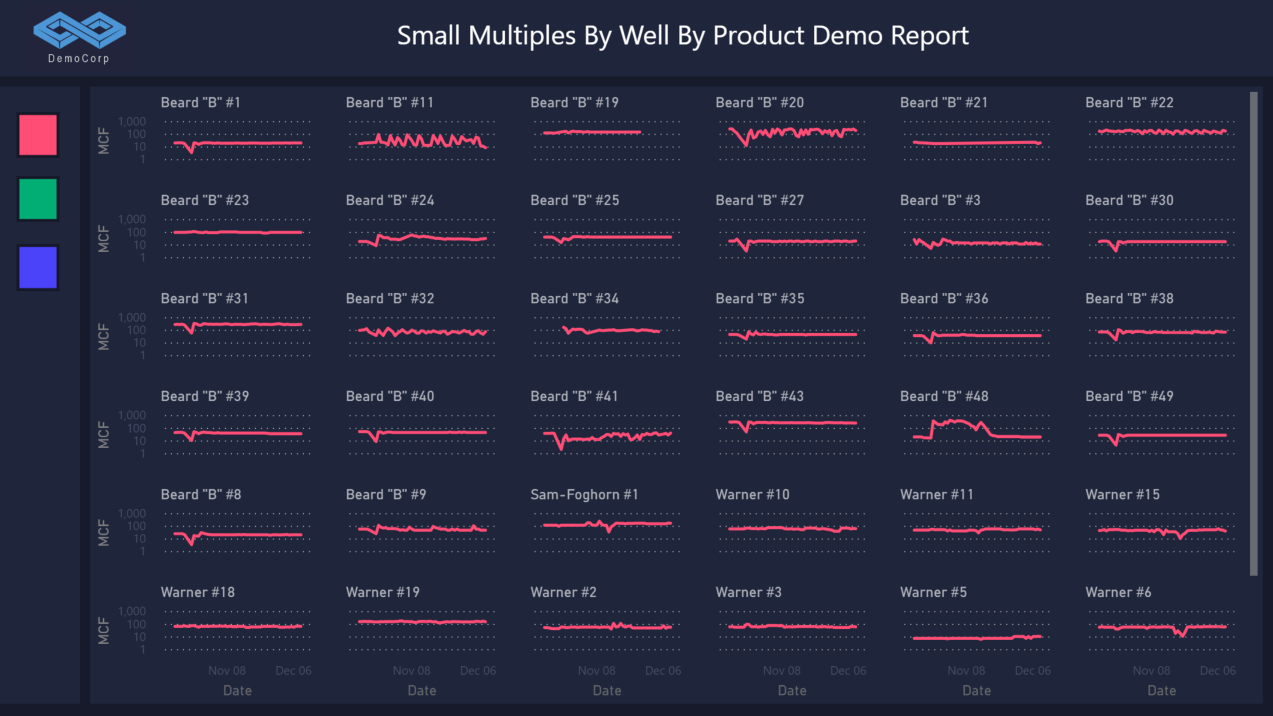 Small Multiples Gas Sales by Well
With the new Small Multiples feature, you can display 36 charts on the canvas at one time in a 6 x 6 grid. If you have more than 36 entities in your dataset, they will be shown as you scroll down the page.
“Grid layout” is the primary setting used to create a view like this. You can find it in the Visualizations pane under the Format menu options for the chart you want to configure. Set the Rows and Columns to 6.

Sparkline Slicer
 Sparkline Well Slicer by Barrel of Oil Equivalent (BOE)
In this sample, I configured a BOE time series line chart using small multiples by Well Name and configured the grid layout to 6 rows and 1 column. If you have a slicer that you would like to add some context to, you can utilize an approach like this.
You will need to be mindful of configuring the interactions between visuals and holding down the Shift key while clicking between visualizations. Small Multiples is still a preview feature and the Power BI team are still refining the interactions.
Production Trellis
I mentioned that I was looking forward to the small multiples feature and there was a reason for that. In 2017, I was trying to replicate trellis functionality from Spotfire in Power BI. At that time I do not even think there were any Small Multiples/Trellis custom visuals in the AppSource.
For that project, I placed four line charts on the report canvas to give the clients a similar view to their legacy Spotfire dashboard. I was hoping the new Small Multiples feature would allow me to create a similar report using one chart.
Below are the 2017 prototype and the 2021 attempt using the Small Multiples feature

4 Chart Prototype from 2017
 1 Chart with Small Multiples Feature from 2021
I was able to get close, but the current limitations of the visual feature would prevent me from implementing it in a production scenario without very specific caveats around the data.
There are three limitations I would like to point out that are present in this example. One of the obvious limitations is not being able to set the “Data Color” by Small multiple, which is “Product” in this specific example.

The next most obvious limitation, is that each Small Multiple chart has the same range on the Y axis. This limitation makes it hard to visualize changes in series that are at the lower end of the range. Comparing the “BOE” lines between the two screenshots demonstrates this limitation.
The third limitation I wanted to point out is that currently Small Multiples can only be sorted by the data field in the “Small multiples” well, once again “Product” in this specific case. It is not possible to sort by another data point, like Volume. For most use cases small multiples will appear alphabetically unless you define the sort order for the category you are trellising.
The blog post from the Power BI team details these limitations, and some of them will be resolved once the feature is out of preview and generally available.
Limitations aside, I am still very excited about this feature. Generally I prefer to use the standard Power BI visualizations over custom visuals, even if it sometimes requires a little more time and imagination in the design phase. Being able to add the functionality illustrated in these quick examples expands Power BI’s out-of-the-box visualization capabilities and gives report designers more tools to utilize.
I hope you found this test drive of the Small Multiples preview feature interesting. If you are interested about Power BI features or Power BI use cases, please contact us.